Product page
The e-commerce product pages showcase all product details and media items related to the relevant products. It is possible to customize the images and videos section, choose which product information to display, show specific buttons, customize the attribute details section, enable additional organizational features, and add content using building blocks.
Product images and videos
After adding media items on the product form or upon product creation in the frontend, customize them on the frontend product pages. To do so, navigate to the relevant product page in the online shop, click Edit in the upper-right corner, and navigate to the Style tab.
Tip
To access the relevant product page from the product form in the backend, click the Go to Website smart button at the top of the form.
To manage individual media items, click the item on the product page and scroll down to the Image section of the website editor. You can then Replace or Remove the image or video and Re-order the items. Use the (left double arrow) or (right double arrow) to move the media to the first or last position, and the (left arrow) or (right arrow) to move them by one position.
To adjust the layout of the images and videos section, go to Images Area and define the images’ size and Position. Then, navigate to the Images section, and use the following options to customize this section:
Main image: Click Replace to change the main product image.
Note
It is not possible to use a video as the main media item.
Extra Media: Add More images or videos (including via URL) or Remove all media items.
Display: Choose between the following layouts when you use more than one media item:
Carousel: This option allows visitors to navigate from one image to the next using the (left arrow) or (right arrow). Show Thumbnails on the (Left) or at the (Bottom) and adapt the corner Roundness of the images.
Grid: This layout displays media items in a square layout. Adjust the number of Columns and define the Spacing between the images in the grid, if necessary.
Auto-crop: Choose a size to cut/trim images to match the page layout. This is useful when designing the Mobile layout.
Zoom on click: Enable image zoom when visitors click an image.
Page layout and product information display
To customize the layout of the product pages, access any product page, click Edit in the upper-right corner, and navigate to the Style tab. Then, go to the Page Width setting and choose either the Regular or Full-width option.
Tip
You can choose a different width for the shop page.
Select which product information appears on product pages using the options available in the Product Details section. You can configure buttons, define how attributes are displayed, organize the page using page customization features, and add content using building blocks.
Attributes
Choose how product attributes are displayed in the Specification section of the product page:
None: Do not show the details.
Bottom of Page: Show the details at the bottom of the page.
In accordion: Show a foldable table directly under the ordering options.
Note
The specification section is only displayed when product variants are enabled, and at least one attribute has been defined for the product.
Tip
Create attribute categories to better structure this section.
Use the Image attribute display type to show images of product variants on the product page.
Page organization options and additional features
Toggle the following options on/off to enable or disable features across all product pages:
Separators: Organize the page and improve visual clarity.
Tax Indication: Indicate whether the price is VAT included or excluded.
Tags: Display the tags created in the backend on product pages and enable customers to filter products by those tags.
Terms and Conditions: Display a link to your terms and conditions.
Reviews: Allow logged-in portal users to submit product reviews. To add a review, users must navigate to the Customer Reviews section at the bottom of the page and click the (plus) icon. They can then select a rating using the (star) icons and leave a comment. The (star) rating is displayed directly under the product name.
Search Bar: Display a search bar that can be shown or hidden independently from the shop page.
Ribbon (or badge): Highlight a specific product.
Tip
It is possible to enable additional features and display information previously configured in the backend:
Click & Collect: Show the order pick-up location and delivery availability on the product page.
Description: Display an e-commerce-specific product description right under the product name.
Packagings: Offer different types of packagings.
Documents: Add relevant documents, such as user manuals or other supporting materials.
Alternative products: Suggest similar products and customize the section.
Show Available Quantity: Display the available product quantity when the quantity falls below a specified threshold.
Out-of-Stock Message: Display a customized message for products that are out of stock.
Get notified when back in stock: Customers can insert their email address to receive a notification when the item is back in stock.
Product Page Extra Fields: To enable specific extra fields for the product page, enable the developer mode. Then, go to , select the relevant website, navigate to the Product Page Extra Fields tab, and under Field, click Add a line to add as many additional fields as needed, e.g., the barcode number of the product.
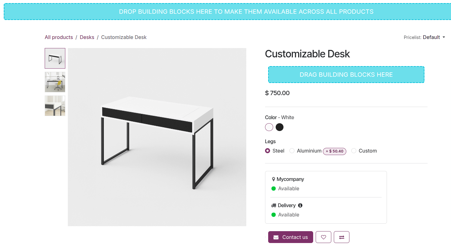
Building blocks
Use building blocks to add content and design elements to all product pages or to a specific one. To do so, navigate to any or the relevant product page and click Edit in the upper-right corner. Then, in the (plus) Blocks tab, select a building block, and drag and drop it:
into the blue area at the top or bottom of the product page to make it available on all product pages, or
into the blue building block area below the product title or below the ordering options to display it only for the current product.
Note
These building blocks do not appear on the shop page.
See also